The perception of depth plays a critical role in visual arts and design, influencing how viewers interpret and engage with two-dimensional compositions. RGB (Red, Green, Blue) colors, foundational in digital media, offer versatile tools for artists and designers to simulate depth, enhance realism, and create immersive visual experiences.
Understanding how to manipulate these primary colors allows for the creation of dynamic contrasts, subtle gradients, and realistic lighting effects, thereby transforming flat surfaces into captivating, multidimensional artworks.
RGB Colors
According to rgb-hex, RGB is an additive color model where colors are created by combining different intensities of red, green, and blue light. This model is widely used in digital displays such as monitors, TVs, and cameras, where each pixel is composed of varying levels of these primary colors to produce a full spectrum of hues.
Techniques for Creating Depth and Dimension
- Shading and Highlighting
One of the most fundamental techniques for creating depth is through shading and highlighting using RGB colors:
- Shading: Using darker shades of RGB colors to simulate shadows and areas of less light.
- Highlighting: Employing lighter hues to mimic reflections, highlights, or areas of direct illumination.
By strategically applying shading and highlighting, artists can give flat shapes and forms a three-dimensional appearance, enhancing their realism and depth.
- Gradient Effects
Gradient effects, both linear and radial, are powerful tools for creating smooth transitions between colors and simulating curved surfaces or variations in lighting:
- Linear Gradients: Transitioning colors along a straight line, useful for creating depth in backgrounds or surfaces.
- Radial Gradients: Radiating colors outward from a central point, ideal for creating focal points or simulating spherical objects.
- Color Contrast and Depth Perception
Understanding how colors interact to create contrast and depth perception is crucial:
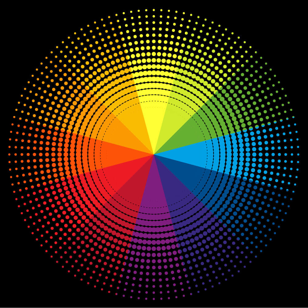
- Warm vs. Cool Colors: Warm colors (reds, oranges, yellows) tend to advance visually, while cool colors (blues, greens, purples) recede. Using this knowledge can help artists push elements forward or back within a composition.
- Complementary and Analogous Colors: Complementary colors (opposite on the color wheel) create strong contrast and can enhance depth, while analogous colors (adjacent on the wheel) create harmony and continuity within a design.
- Texturing and Layering
Texture and layering techniques add tactile qualities to surfaces and objects, further enhancing the perception of depth:
- Texturing: Adding subtle textures using patterns or noise can make surfaces appear more realistic and tangible.
- Layering: Overlapping elements with varying opacities creates depth by suggesting spatial relationships and occlusion.
Depth Perception: Contrast and Brightness
Changing how bright or dark and how different the light and dark parts are can really change how deep things look in RGB colors. Making the contrast higher makes things stand out more from each other, making them look more 3D and separate.
Adjusting brightness can change how the whole scene feels, making it look deeper or not as deep. By balancing contrast and brightness carefully, artists can make RGB colors look like they have more depth, making the picture more interesting to look at.
Shadows and Highlights in RGB Depth
Shadows and highlights play crucial roles in adding depth and dimension to RGB color compositions. Shadows create areas of darkness where objects block light, giving a sense of volume and form to elements in the composition.
Conversely, highlights are areas of brightness that indicate where light is reflecting off surfaces, emphasizing contours and adding a sense of surface texture and curvature. Together, shadows and highlights create contrast and depth, making RGB color compositions appear more lifelike and dynamic. Adjusting their intensity and placement can significantly enhance the perception of depth and realism in digital art and design.
Color Temperature Impact on RGB Depth and Dimension
The color temperature, whether warm or cool, affects how we perceive depth and dimension in RGB color compositions
Warm Colors (Reds, Oranges, Yellows):
- Advance or come forward in the composition.
- Make objects appear closer and more prominent.
- Enhance the sense of foreground elements.
Cool Colors (Blues, Greens, Purples):
- Recede or appear farther away in the composition.
- Create a sense of depth and distance.
- Emphasize background elements and spatial depth
By strategically using warm and cool colors, artists can manipulate the spatial relationships within an RGB composition, enhancing the overall perception of depth and dimension.
Conclusion
Ability to create depth and dimension using RGB colors is both a science and an art. By understanding the interplay of shading, gradients, color contrast, and temperature, artists can transform flat images into dynamic visual experiences.
Whether it’s through the careful balance of shadows and highlights or the strategic application of warm and cool hues, RGB colors offer endless possibilities for artists to explore spatial relationships and enhance the realism of their creations. By mastering these techniques, artists can unlock the full potential of RGB colors to captivate viewers and convey depth in digital art and design.

